In this mobile revolution age around 2.5 billion users (2019 survey) using smart phones in the world. That means almost 65% people use smartphones and browse websites in the mobiles. People don’t have time to open PC. Most of the online related work people can do on the phone while they are travelling, eating as well as on the bed. So according to, that time and technology has been changed and simultaneously people also go with the technology.
Most of the websites re-innovates and revamped with responsive layouts and device friendly such as desktop, laptop, tablet and mobiles phones right. People browse many sites in the mobile like stock market, ecommerce, hotel booking, gmail, linked In, facebook and marketplace every day.
So why am telling this most of the users preferred to browse websites in the mobile and according to that your website should be compatible as per the latest technology and responsive, a responsive or fluid layout is device friendly means user can browse your site in any device without any issues. So, when you go to make ready your site as trending and responsive. A responsive website can bring more users to the site and help to generate more leads in the business. Otherwise your business will stay back and can’t run with the frequent changing technology and lifestyle.
Now we are going to go over some simple guidelines to ensure your website’s mobile experience is designed to please and convert!
Mobile Site Should Simple, Consistent and Easy to Use
As you know, mobile screens are much smaller to navigate than desktop or laptop screens so only give essential information you need to make the user experience pleasant and clear. Too much information can be distracting and frustrating to user on the mobile due to small screen. Few things need to keep in mind such as:
- User Experience(UX) part should be done before design any website
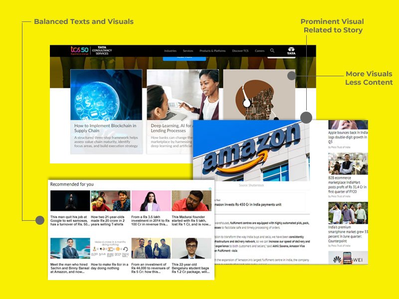
- Less content and more visuals need to add in the web pages
- Prioritize the content as per the user requirement
- Landing page should be clean, clear and concise.
- Add a bold and flash button for click to action
- Keep important and demand things across the site
- Navigation and scroll experience should be easy
Font size should be readable and visible

Use normal and soothing font which is easy to read and clear. Keep font size at least a 14 to 16 point font size for paragraph texts. Keep the fonts structured and less stylized. Here are some beautiful, more design savvy fonts that are legible and will look fantastic.
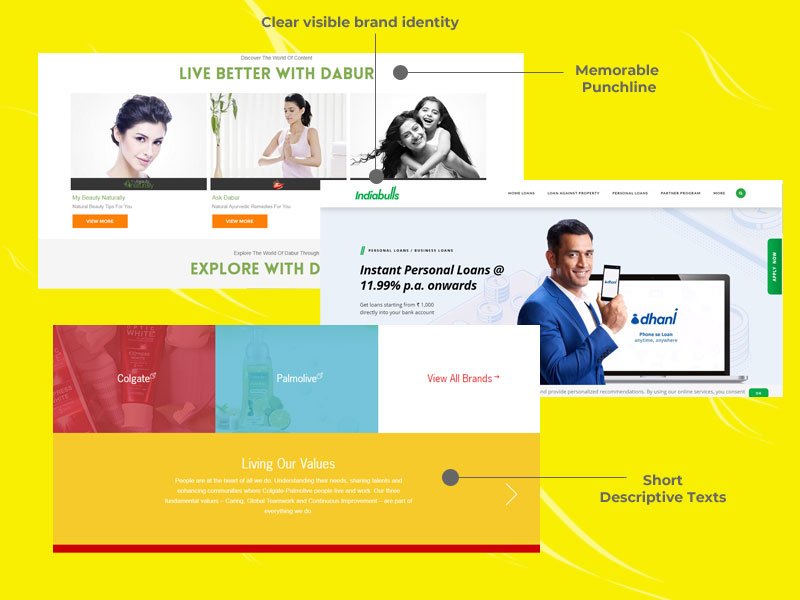
Create Memorable Phrases

Remember keep your text short, sweet and to the point. Text line should be catchy and memorable phrases that your audience can easily remembered and tweet. Include a short testimonial from a satisfied customer. Mobile landing page is where you should consider using the following:
Punch line, Slogans, Mission Statements, Short Descriptive Phrases, add bullets to the points
Add Visual Image to Webpage
An image says 1000 words. In a visually tight space like mobile, use image instead of more text is a great choice. Use visuals that will draw your audience attention.
You can also use non-distracting photo or abstract image as the background of your page.
Always remember your images should be optimized for web and compressed by image editor for downloading faster. Image Optim and Tiny PNG are good tools to reduce image size without losing quality. Creating a visual experience that is pleasing to the eye and not too distracting.
Performance
If your site has any special features, be sure to test these as well. Testing isn’t finished when the site goes live. You need to evaluate how your site performs with visitors over time by monitoring your user statistics in Google Analytics, especially your bounce rate and goal conversion rate. You can see a breakdown by going to Audience - Mobile - Overview in Google Analytics.