
User interface design is a part of user experience. In the visual design, design elements are the basic units of any visual design which form its structure and convey visual messages. The Art of color and design defined the elements of design as line, direction, shape, size, texture, value, and color, soon. Now these days, design pattern changed, style also changed designers using advanced and professional tools to create hi-end visual design.
Here a question in my mind. How to make a visual design make successful? A successful visual design applies the following principles to elements noted above and effectively brings them together make balance in a way that makes sense. When trying to figure out how to use the basic elements in the design as consider:
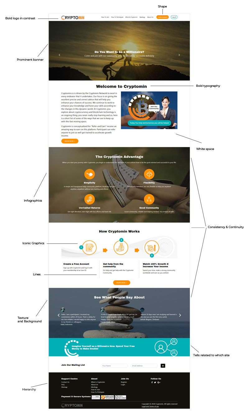
Hierarchy
Following hierarchies in the design pattern means you are professional designer. Most probably, designers create hierarchies through different font sizes, colors, and placement on the page. Usually, items at the top are perceived as most important.
Continuity and Consistency
When you create visual design mockups for any application might for mobile or desktop. You need to follow consistency and continuity pattern across the application.
Suppose buttons and its placement of position, style, color and sizes need to make same across the application. You never change buttons position somehow in the left or right or top and bottom. Similarly, if button color is yellow then need to follow the color of the buttons in yellow use for same purpose anywhere in the application.
Balance
Balance creates the perception that there is equal distribution. Maintaining balance in terms if you are using multi colors in the design, typo sizes like so on. This does not always imply that there is symmetry.
Contrast
Contract focuses on making items stand out by emphasizing differences in size, color, direction, and other characteristics in the design.
Whatever you have designed, that should stand out in the design. A design can look pretty, but still not serve its intended purpose as a communication tool. One of the challenges for designers is balancing form with function you want your design to look nice and be visually appealing to its audience, while still communicating its message successfully.
Scale
Using the relative size of elements against each other can attract attention to a focal point. It’s a range of sizes; it creates interest and depth by demonstrating how each item relates to each other based on size.
Similarity
Similarity means same consistency and continuity which already I defined as above. A consistent and similar design is an important aspect of a designer's work to make their focal point visible
Color Contrast
Color contrasts are studied with a pair of colors, as opposed to color harmony, which studies a set of colors. There are seven kinds of color contrasts have inspired past works involving color schemes in design. This is applied while you are creating a logo and that is how standing out in terms of design.
Typography
Font size, font family, spacing and indent between text and lines, font colors, alignment are the part of typography. This is of the most important part in the design whether it is for web or print. As a designer, if you can play with the typography means you are a good visual designer. It’s always make the perfect balance combination in the visual design to bring richness in the design.
Texture and background
Texture basically uses to balance the empty space in the design. Texture is alos called watermark that is repeating an element, a texture will be created and a pattern formed. Texture can be used in the background of the page, banner and somehow in the box type design.
Iconic graphic
Iconic graphic is going on while web 2.0 comes in the market. Iconic design or graphic is more visual appealing than a photograph and graphics there. An appropriate icon tells more words rather than more texts. Icons are bringing richness in the content and easy understand by the user about the subject going on there.
Infographics
Infographic means information and graphics. It’s a graphic visual representation of information knowledge intended to present information quickly and clearly. It is also improve cognition by utilizing graphics to enhance the human visual system's ability to see patterns and trends. Using Info graphics in the website or mobile app is one of the best visual trends now these days.
By Editorial Team,
UXD Media
Date: 20/07/19